Tuesday, June 16, 2009

Project 3: Final Model


The sectional model 1: 100


The material of the building is glass, concrete, and steel.


The hologram tree and artworks. Those are flying over in the sky.


Model showing front facade.


Site Model 1: 500 showing the art gallery and the relationship with adjacent buildings and the streets.


Project 3: Perspective Views


The perspective view showing the front facade of the gallery which is the combination between the digital artworks, glass cubes and steel. It reflects the characteristics of the artist which is use linear line, rectangular shapes, and repetition. I applied this kind of concept to the building to make it cohesive.


This is the display room. This picture shows the quality of the light and the shadow which being applied to the gallery space.


This is the digital tunnel. The artwork will run through the steel columns surround it as you walking inside of it.


This is the space where the client and the artist can meet and talking about the artwork. The client can modify the artwork to what they want.


The staircase to the first floor.


The living area which is located at the back of the site. I located more private space at the back due to the privateness to the artist. At this area, the artist will have his very own private time and space.


The living area with the shadow and the quality of the light.


The staircase which channeling the office and the living space.

Project 3: Final Drawing 2


Rendered Drawing showing the quality of the light in the living room area. It can be seen that the light comes through between the gaps of the wall of the building produces interesting shadow.


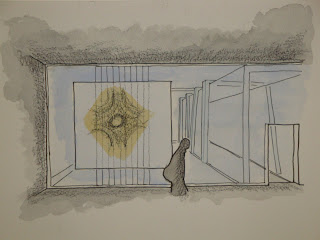
Rendered drawing showing the space quality in the display room. It shows the relationship between the artwork and the shape of the building. Moreover, it also shows the idea of transparency which being applied into the gallery.


This rendered picture shows the quality of darkness and lightness in a space/tunnel. It creates a sense of experience of walking through the tunnel.

Project 3: Final Drawings


Section cut, showing the art in the object


Ground Floor Plan


First Floor Plan

Section
Section

Project 3: The Idea/Concept

Andy Gilmore is new in art industry, so he just started his debut in art industry and he wants people to recognize his artworks and buy his artworks. As a result, I come up with an idea to make the gallery which "stands out from the crowd" and really different from the surroundings. As we know, the surrounding buildings are really heritage buildings and I just wanted to make this gallery kind of modern simple building but still attractive. At the end, I decided to choose the idea of transparency and play with the digital artworks at the front facade to attract people's attention. It is because it will easier for the people to see the artworks from the outside of the building and indirectly magnetize people to come in to the gallery. I applied the idea of transparency throughout the building.


This is my first sketches of expressing my ideas.


I also have an idea to make it with clean lines, mostly plain and only basic shapes. It is because his artworks are mostly deal with colour, repetition, etc, so it is better to use clean lines, and the artworks can be the focal point in the room.
In addition, I also want to play with lighting, because the use of light in right place is very important for this kind of artworks. The use of nice and better light will create the artworks more lively and playful.


Rough design for the side facade and the interior of the gallery.


At the end, in general I decided to take the idea transparency throughout the building and make it different from the surroundings to attract people attention. I decided to play with the digital artworks at the front facade which based on the client's characteristic which is play with repetition , linear lines and rectangular shapes. In addition, the use of digital effects on the inside of the gallery will reflect to the distinctive characteristic of the client. I combined those ideas and applied it to the building.

Project 3: The artist / The client


My client is Andy Gilmore. He is an new artist who just starting his debut in art industry.
He is very exciting to show to the world his masterpiece and hopefully the people will like it and buy his work. As a result, I come up with an idea to make the building stands out from the crowd and a little bit different from the surrounding, to attract people attention.


Project 3: The Site


The choosen site: Site 1
The site is surrounded by heritage buildings which have two or three storeys. Most of the buildings have awnings which aimed to protect the poeple from the sunlight and rain.
Site 1 is chosen because I want to create a sense of private building as well as very strategic for the people to reach the building. I did not choose site 2 because it is very open and noisy since it is located on the corner of the main streets. I also did not choose site 3 because it is only has one main access at the front of the building, even though it is quite private.
Site one is the best site for my concept because it is located on the main street and it has two access fro the poeple to get in. Additionally, it is also get the sense of private area or spaces for the artist to work and live.


The view of the surroundings.

The view of the surroundings.

Some views of the site from different angle

Some views of the site from different angle

The view of the back of the site.


The view of the street anf the surroundings